Referencing the OUAC
General Guidelines
- We refer to our organization by the acronym “OUAC”, or as “we”.
- We refer to our departments by their acronym or short form (e.g., OMSAS, 105).
Exception: Spell out the first instance on official web pages only. (E.g., About the OUAC, Employment, About OMSAS, etc.)
Colours
General OUAC Colours
Gold
Hex: F0BF5B
RGB: 240-191-91
Indigo
Hex: 51608C
RGB: 81-96-140
Plum
Hex: 651A35
RGB: 101-26-53
Sienna
Hex: #B14F46
RGB: 177-79-70
Teal
Hex: 4A7E8C
RGB: 74-126-140
Secondary Brand Colours
Dark Grey
Hex: 3A3A3A
RGB: 58-58-58
Light Grey
Hex: F5F5F5
RGB: 245-245-245
Guidance Website Colours
Student Blue
Hex: #01325B
RGB: 1, 50, 91
Counsellor Red
Hex: #D62100
RGB: 214, 33, 0
Secondary Brand Colours
Guidance Beige
Hex: #747566
RGB: 116, 117, 102
Black
Hex: #000000
RGB: 0, 0, 0
GO2 Website Colours
Raspberry
Hex: #C73649
RGB: 199, 54, 73
Secondary Brand Colour
Dark Grey
Hex:
RGB:
Teal
Hex:
RGB:
Fonts
The OUAC brand font is Roboto, a web font from Google. This font allows our brand to match in print and on screen.
If this font is not available in the program you are using, use Arial.
Icons
Each OUAC department has an icon associated with it to increase recognition.

OLSAS

OMSAS

ORPAS

TEAS

Undergrad
Logos
General Rules of Use
Follow these guidelines when displaying the OUAC logo.
Usage
| Logo Type | Usage | Sample |
|---|---|---|
| Stacked Logo (Vertical) | The stacked logo is the one you should use (where possible). |  |
| Wide Logo (Horizontal) | Wide logos are used on websites and in horizontal designs. |  |
| Single Colour Logo | If a restriction does not allow use of the full colour logo, use the black or white (reverse) logos. The logo colour you select depends on the background colour it is being displayed on. We recommend choosing the one that creates the greatest contrast from the background colour. |   |
| Bilingual Logo | In a bilingual piece, or where space is limited, use bilingual logo. |  |
Spacing
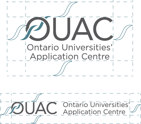
The ideal space around the logo is equal to the “swoosh” in the wordmark. Any space smaller than half of the “swoosh” should not be used.
Sizing
The minimum logo print size is 2 inches in width. The minimum logo digital size is 200 pixels in width. If an application exists where the logo must be under 2 inches, the bilingual logo without the full name can be used. The minimum bilingual logo print size is 1.5 inch in width. The minimum bilingual logo digital size is 100 pixels in width.
Incorrect Uses
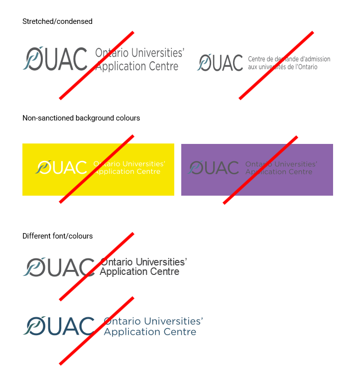
The logo may not be stretched, sized or changed in any way. It must always be portrayed as is.
Logo Colours
The logo wordmark uses the OUAC Blue and Grey colours.
Logo Downloads
Note: Any user has an obligation to ensure that OUAC’s logos are used in accordance with the conditions set out on this page. OUAC Communications and Events must approve all use of the logo. For assistance or to gain approval, email us.
| Format | Notes |
|---|---|
| OUAC Logo – JPG [.zip] OUAC Logo – PNG [.zip] OUAC Logo – EPS [.zip] | In the .zip file for each logo format, you will find the stacked and horizontal English and French logos in full colour, black and white (reverse). |
| Guidance Logo – PNG [.zip] | In the .zip file, you will find the English and French logos in full colour. For more formats, email us. |
| GO2 Logo – PNG [.png] | For more formats, email us. |
Our Brand Story

The Original Logo, 1992-2017
In 1992, the Ontario colleges opened their own application service in Guelph, called OCAS. Shortly after OCAS’ arrival, Guelph postal services began confusing OCAS with the OUAC and both operations began receiving large quantities of one another’s mail, which is why our Executive Director determined that a distinctive logo be placed on all OUAC printed materials to reduce post office confusion.
In addition to differentiating the OUAC from OCAS, the OUAC logo also represents:
- the processing and movement of information in an interactive manner;
- free and open space;
- a path (e.g., to higher education);
- a synthesis of ideas and information;
- open exchange of ideas and information;
- having a capacity for adaptive change;
- service;
- flowing knowledge;
- open communication channels;
- receiving and sending;
- individual movement;
- teamwork; and
- the circle represents the collective Ontario university system.





Recruitment Brand Alignment 2019
In 2018-2019 the OUAC introduced new names and logos for its recruitment activities to provide cohesive branding and clear association with Ontario’s universities. The new branding also closely aligns with the COU’s 2018 rebrand.
